
↓
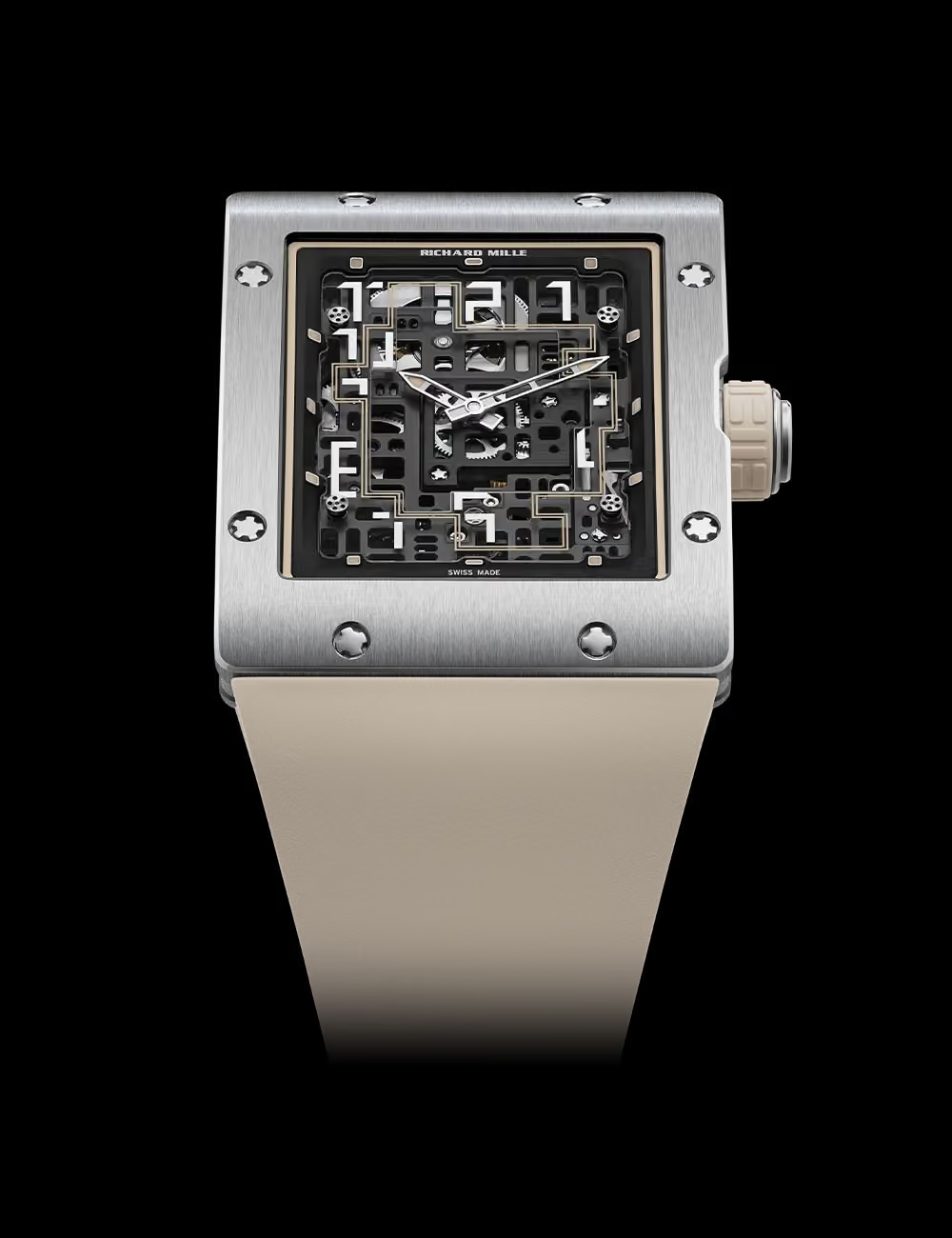
Created as a self-initiated case study, this project explores how the launch of the Richard Mille RM 16-02 could become more than a product release. Rather than focusing solely on the watch, I approached it as an opportunity to build a brand experience inspired by craftsmanship, architecture and contemporary luxury.
From creative direction to campaign thinking, I developed a concept that connected strategy with execution across multiple touchpoints. More than a visual exercise, it reflects how I approach premium branding: creating experiences where every detail reinforces the story behind the product.
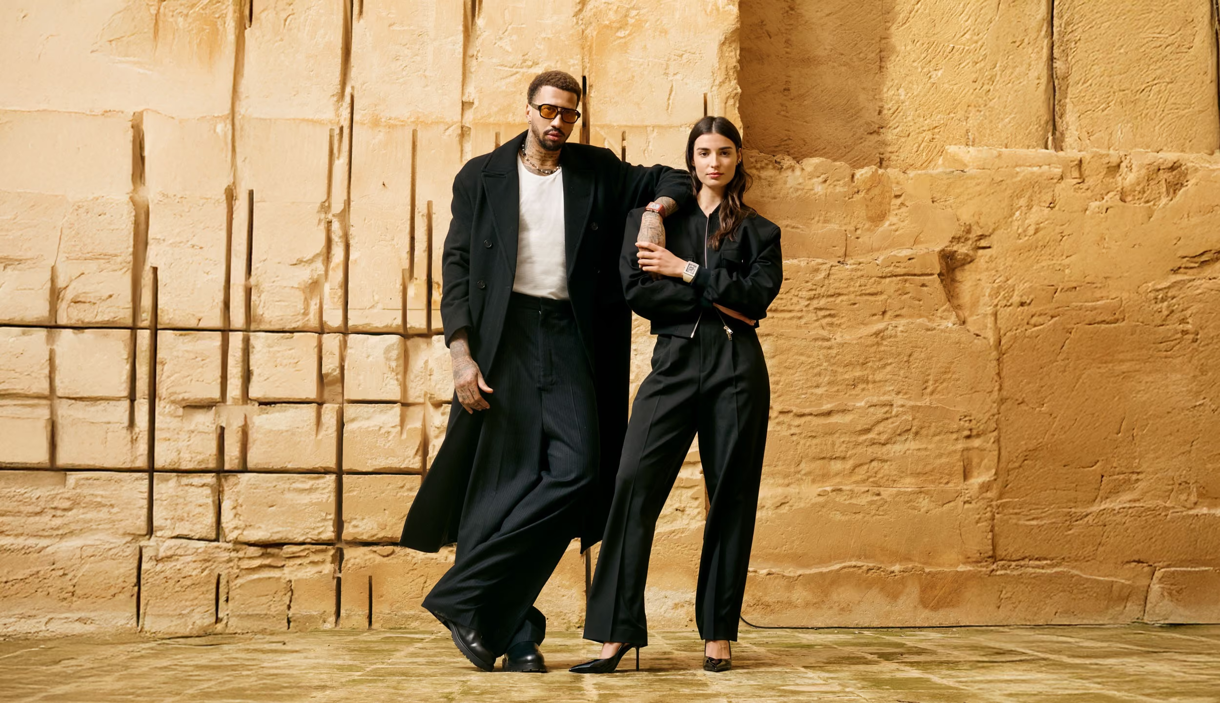
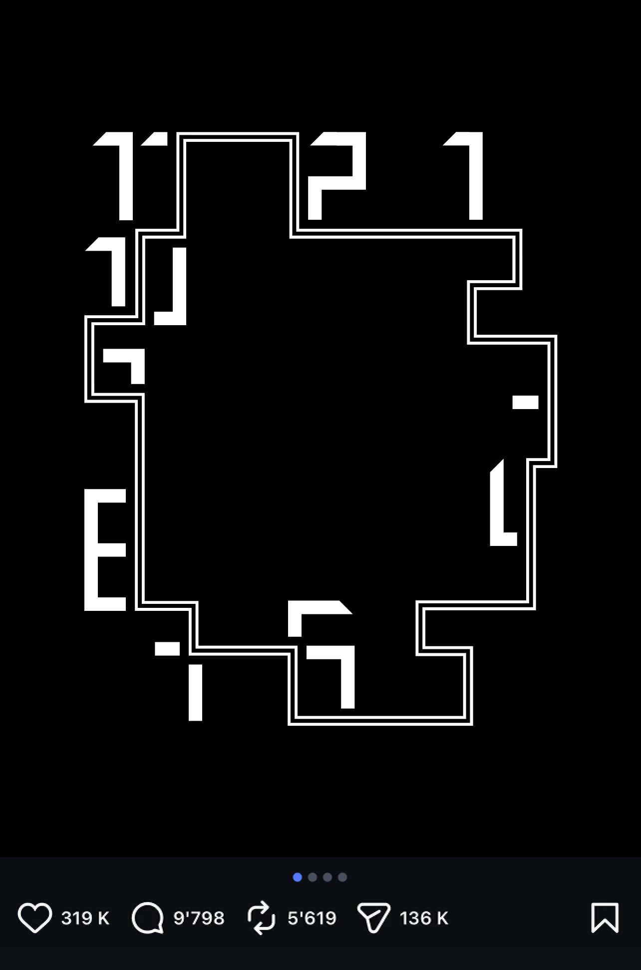
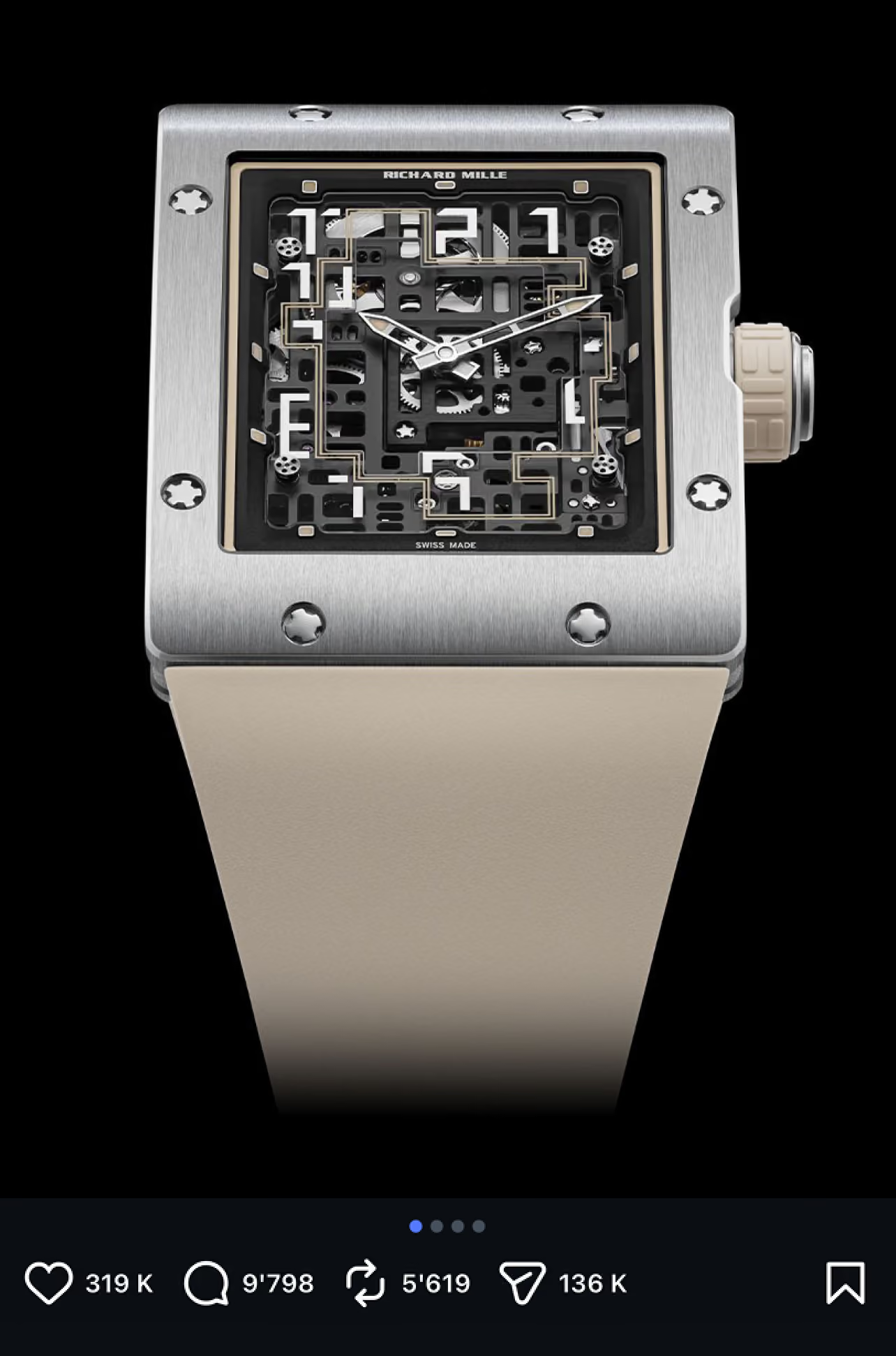
The creative direction was built around a simple idea: revealing the complexity hidden within an exceptionally thin form. Rather than celebrating performance through technical language, I wanted the campaign to express precision through architecture, proportion and carefully controlled restraint.
Inspired by the dialogue between industrial structures and fine watchmaking, every visual decision was designed to reinforce the same perception: strength and sophistication can exist within remarkable simplicity.
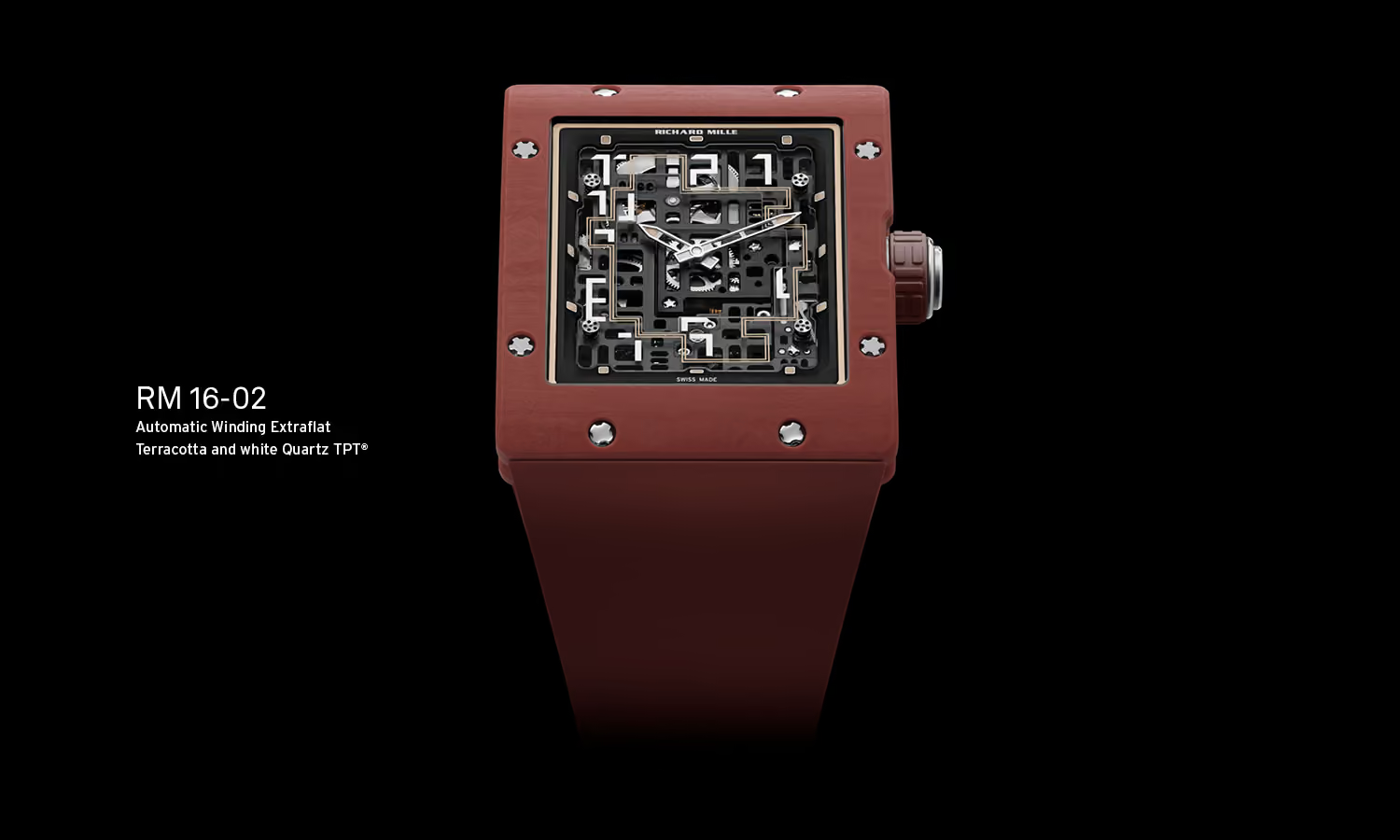
The new RM 16-02 Automatic Extraflat boldly reinterprets the brand's well-established aesthetic codes, showcasing a resolutely brutalist style with its straight lines and monolithic structure.
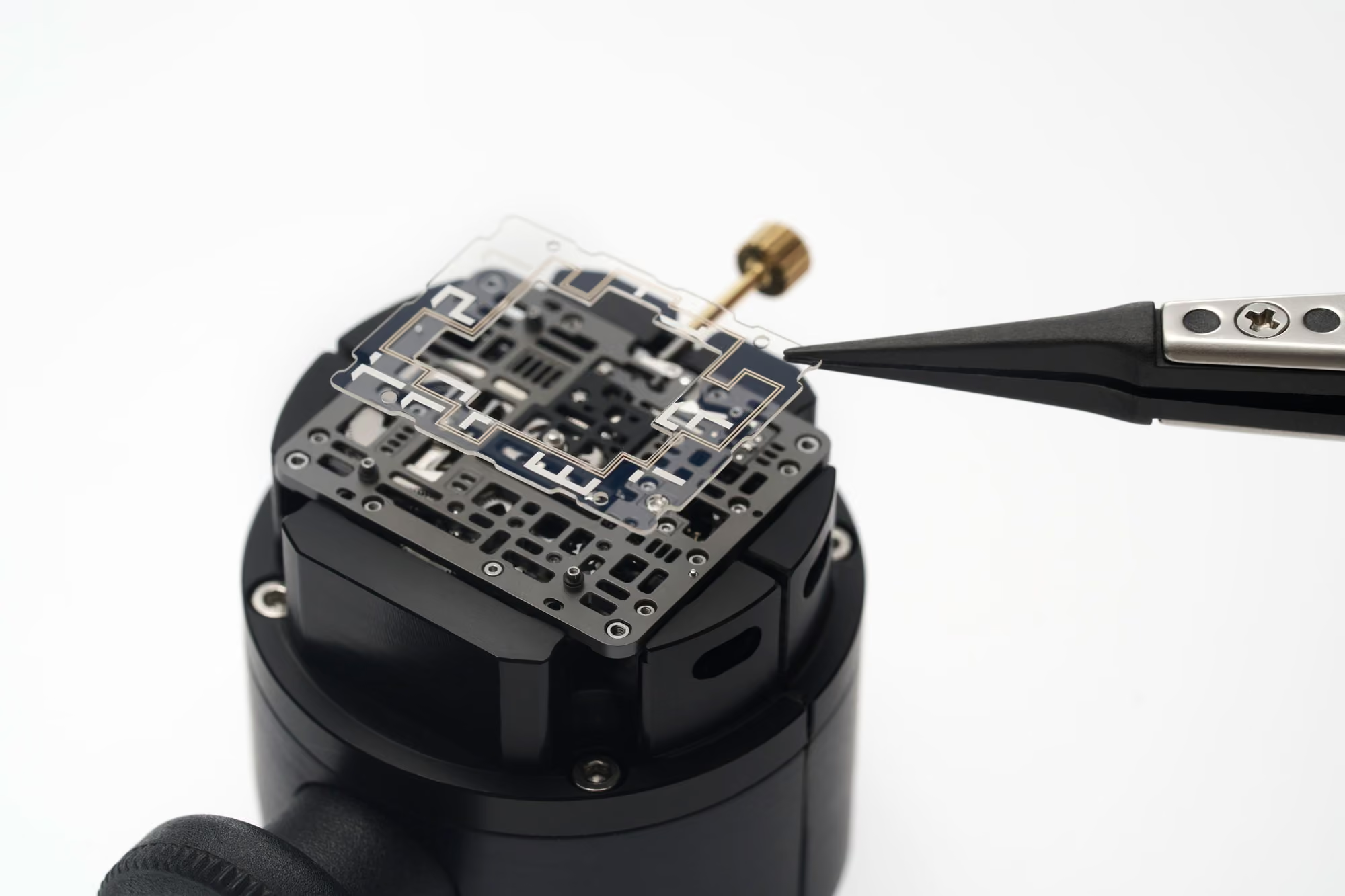
The digital experience was designed to encourage exploration rather than simply present information. Instead of following familiar e-commerce patterns, I imagined a calm, immersive journey where every interaction invites a closer look at the craftsmanship behind the RM 16-02.
Motion, space and subtle transitions work together to reveal the depth of the movement without competing for attention. The interface becomes almost invisible, allowing the product to remain the true focus.
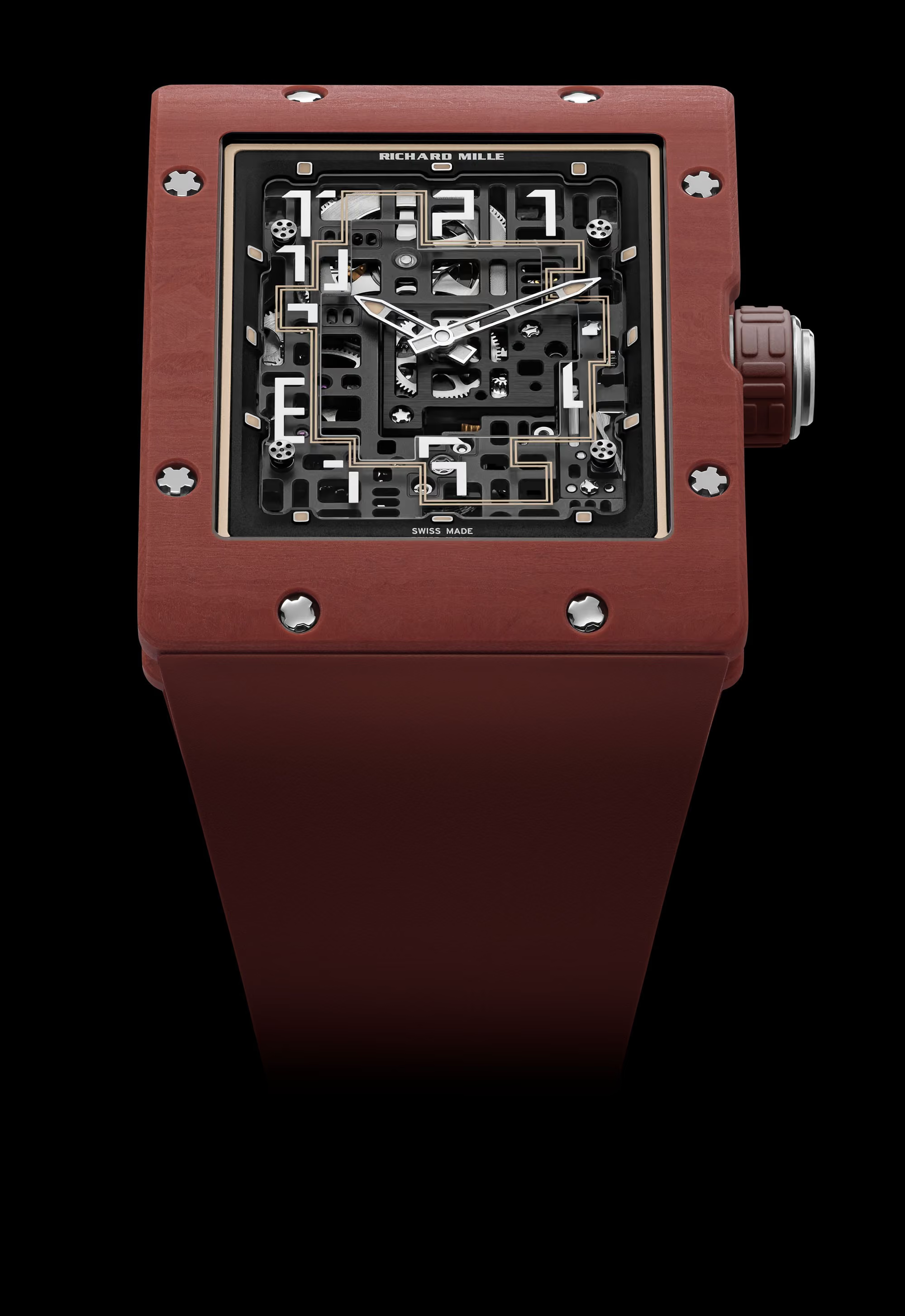
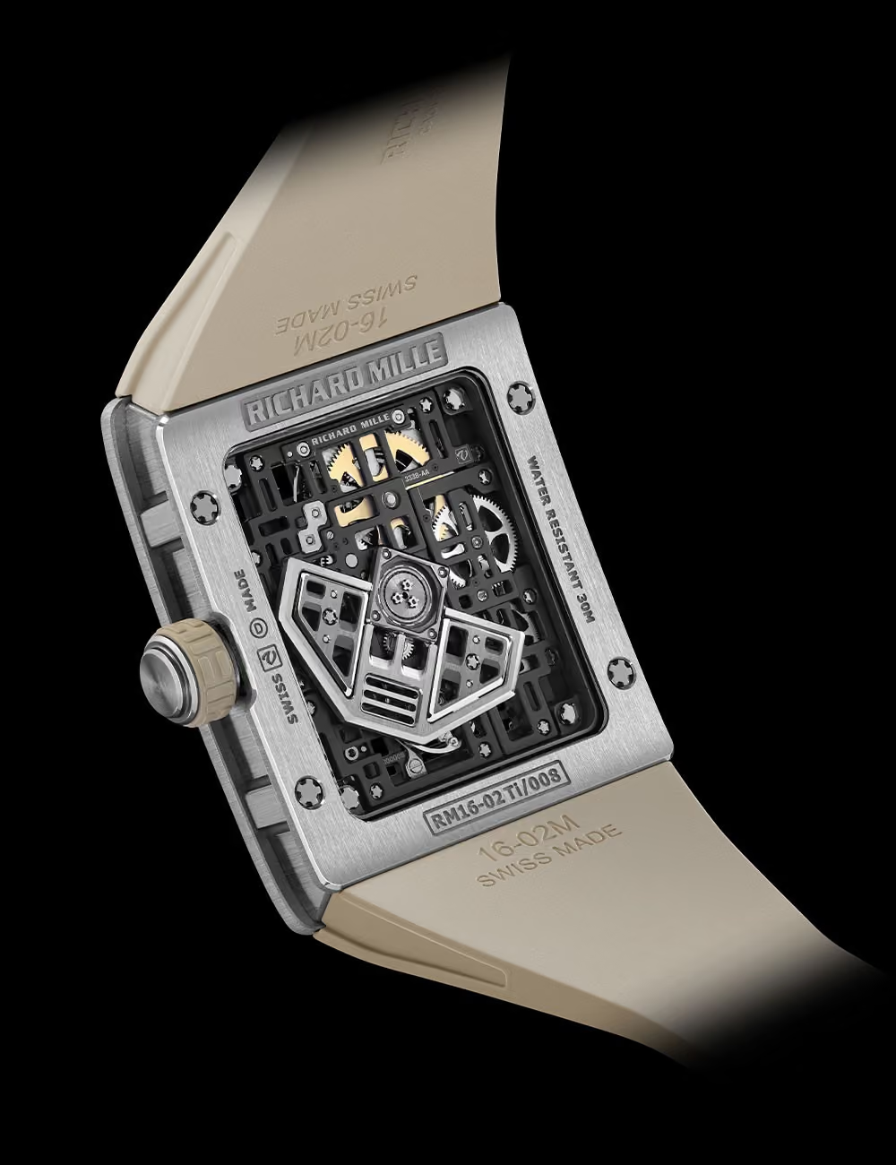
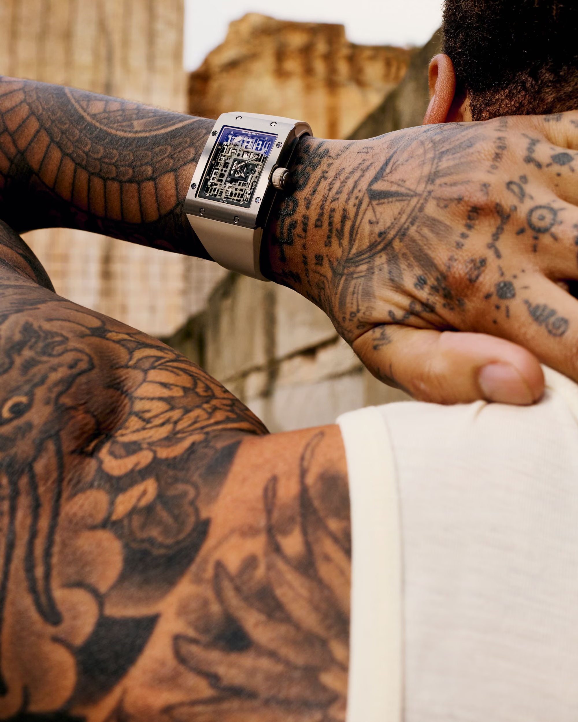
Some products deserve an experience that extends beyond the screen. I imagined this editorial piece as a collectible object rather than a traditional brochure, inviting people to slow down and appreciate the craftsmanship behind the RM 16-02.
Inspired by the watch's architecture, every page was designed with clarity, structure and restraint. The layout becomes a quiet frame where materials, details and mechanical precision naturally take centre stage.
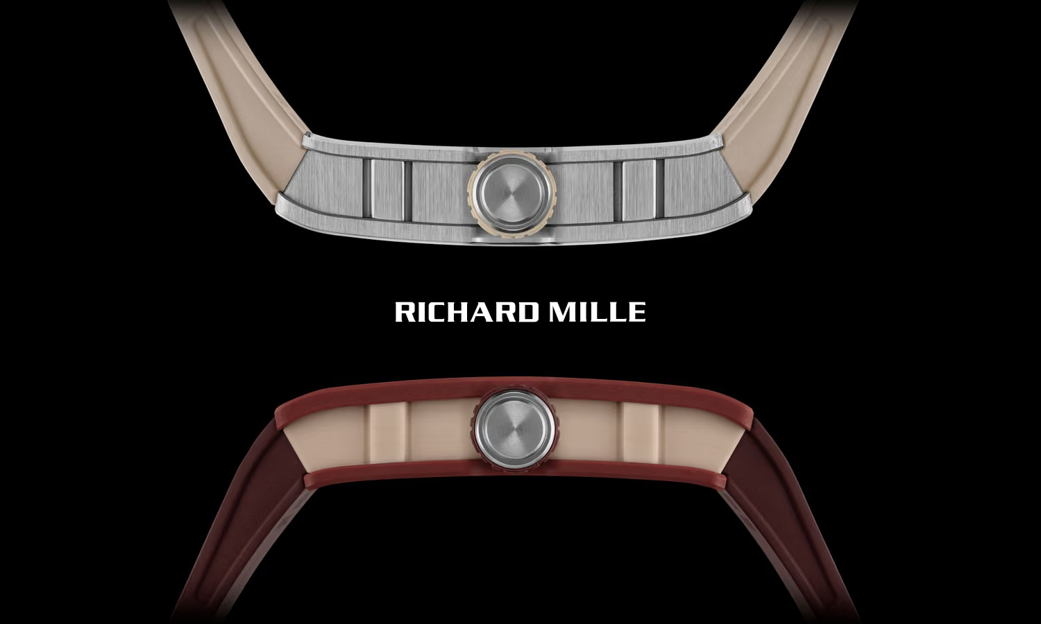
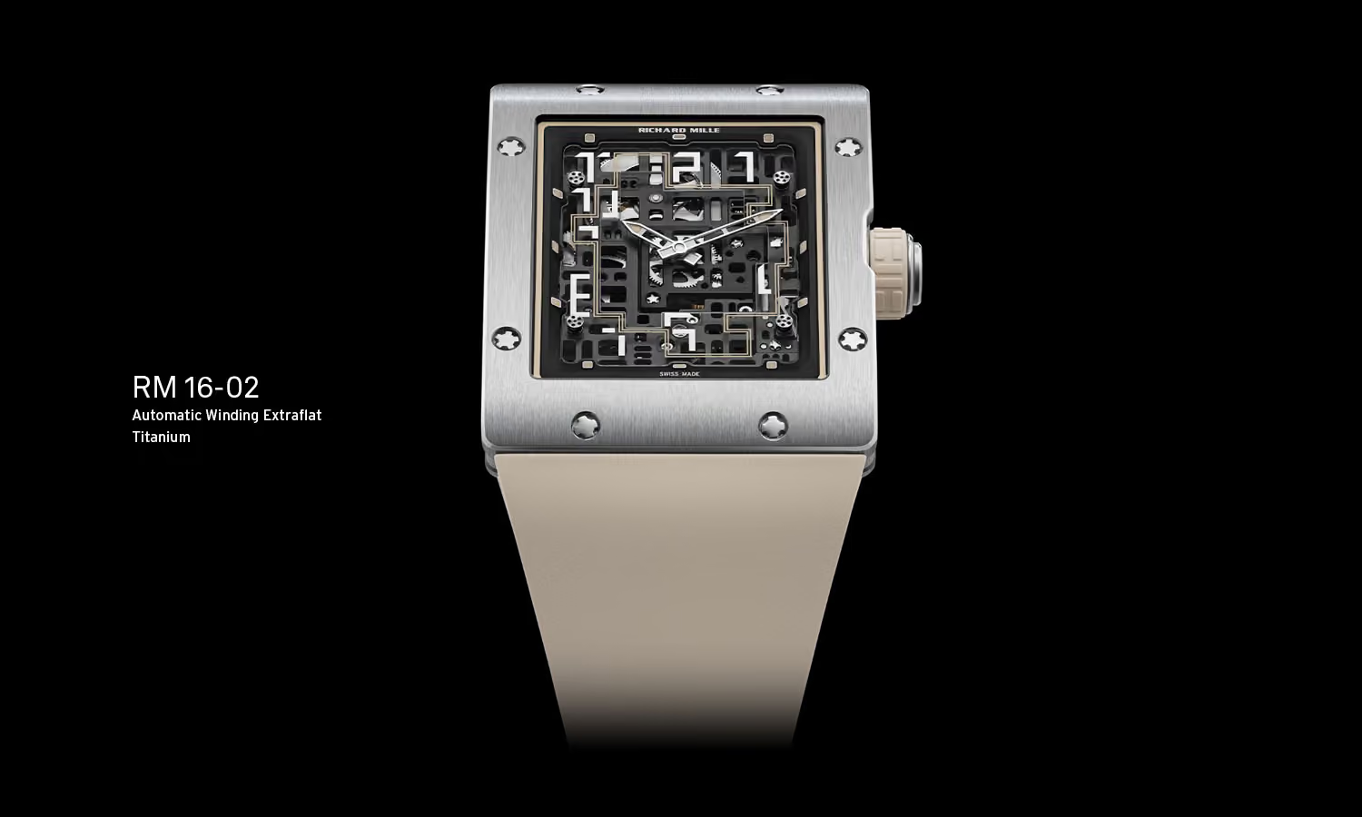
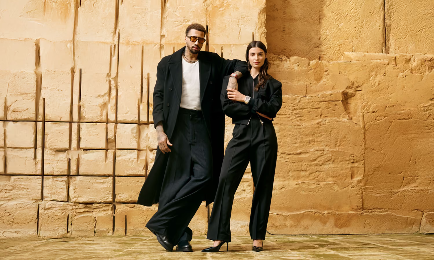
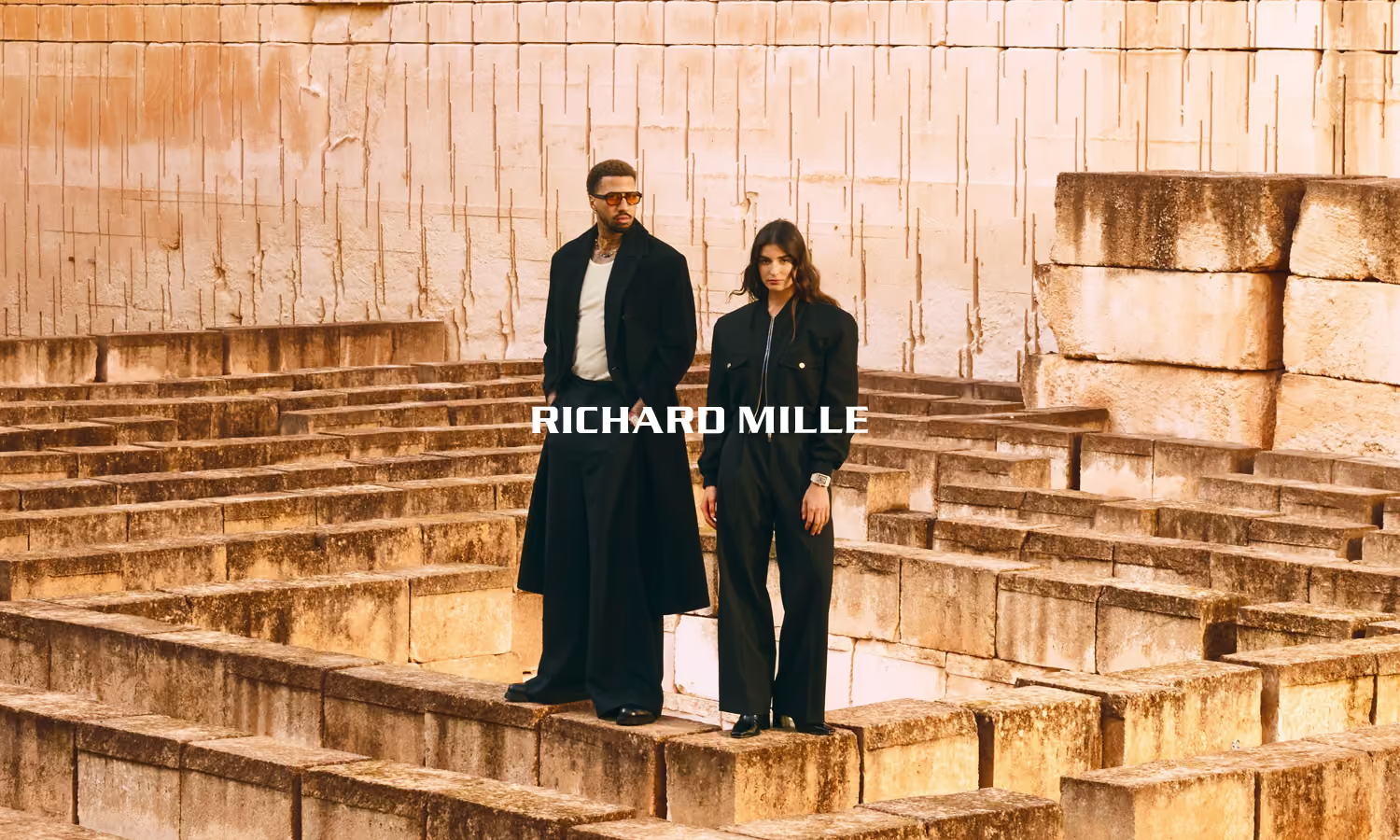
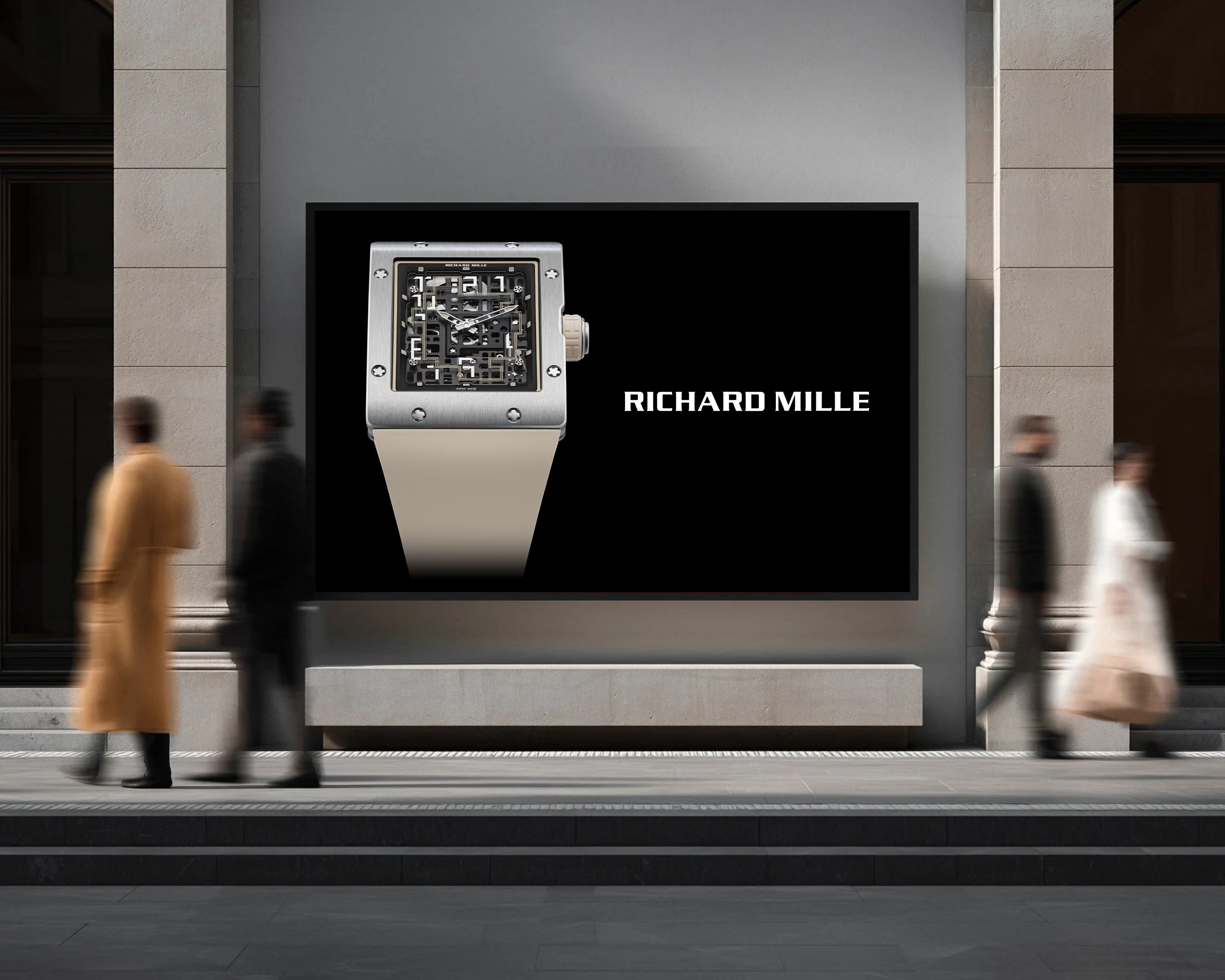
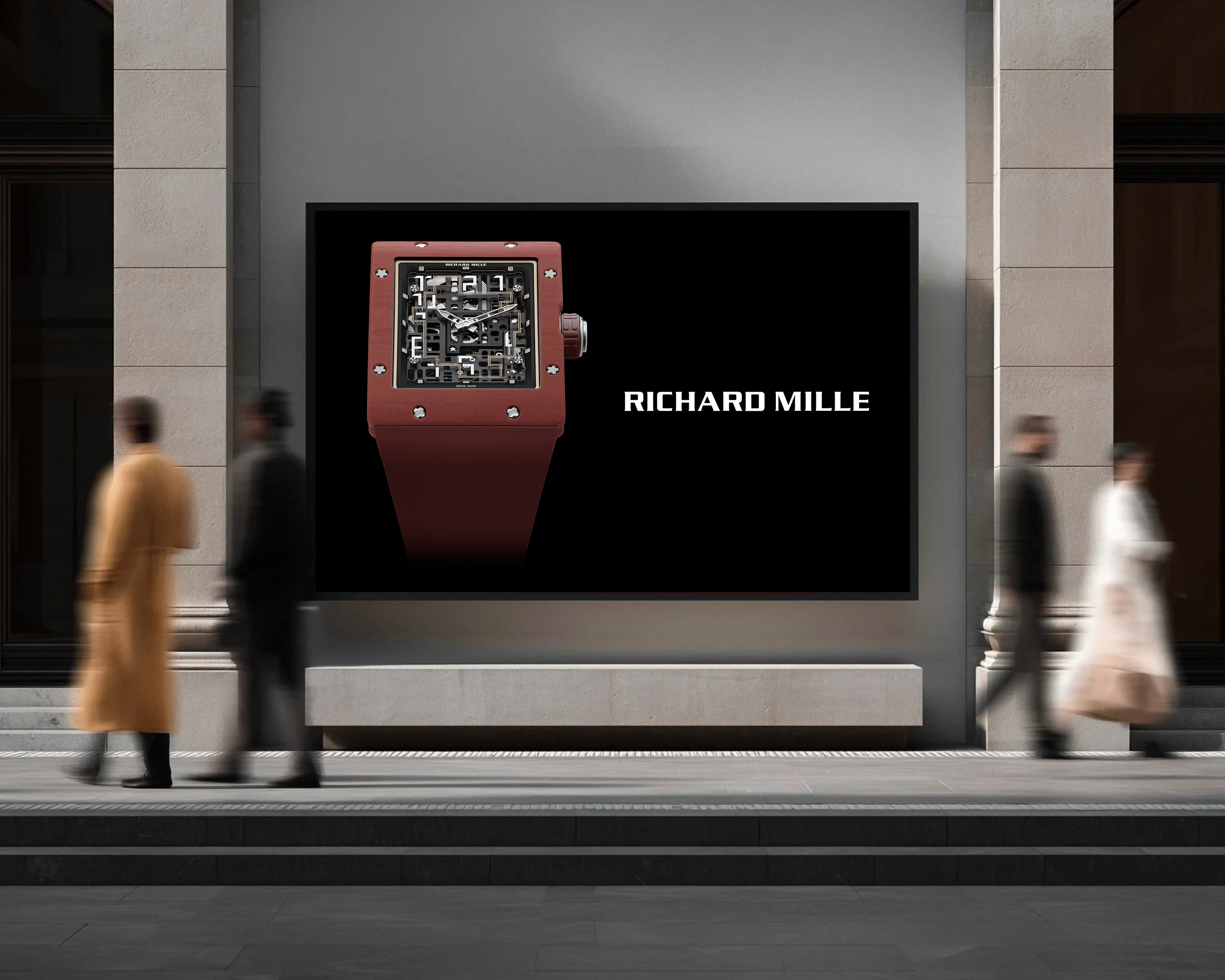
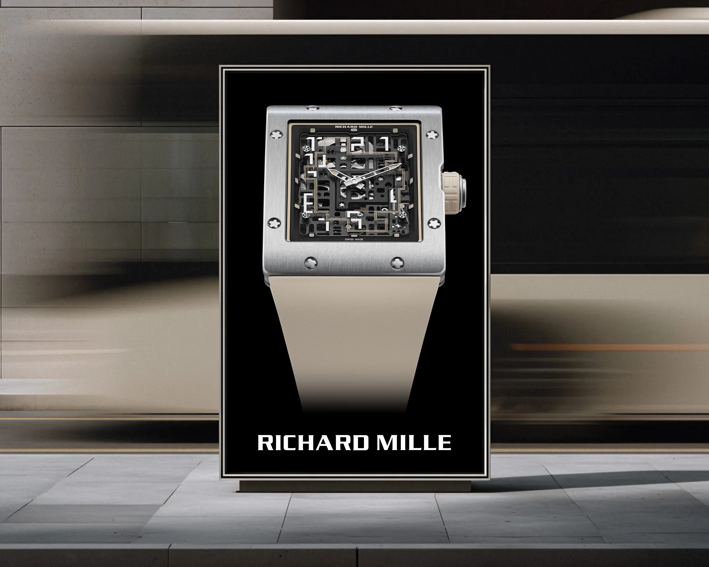
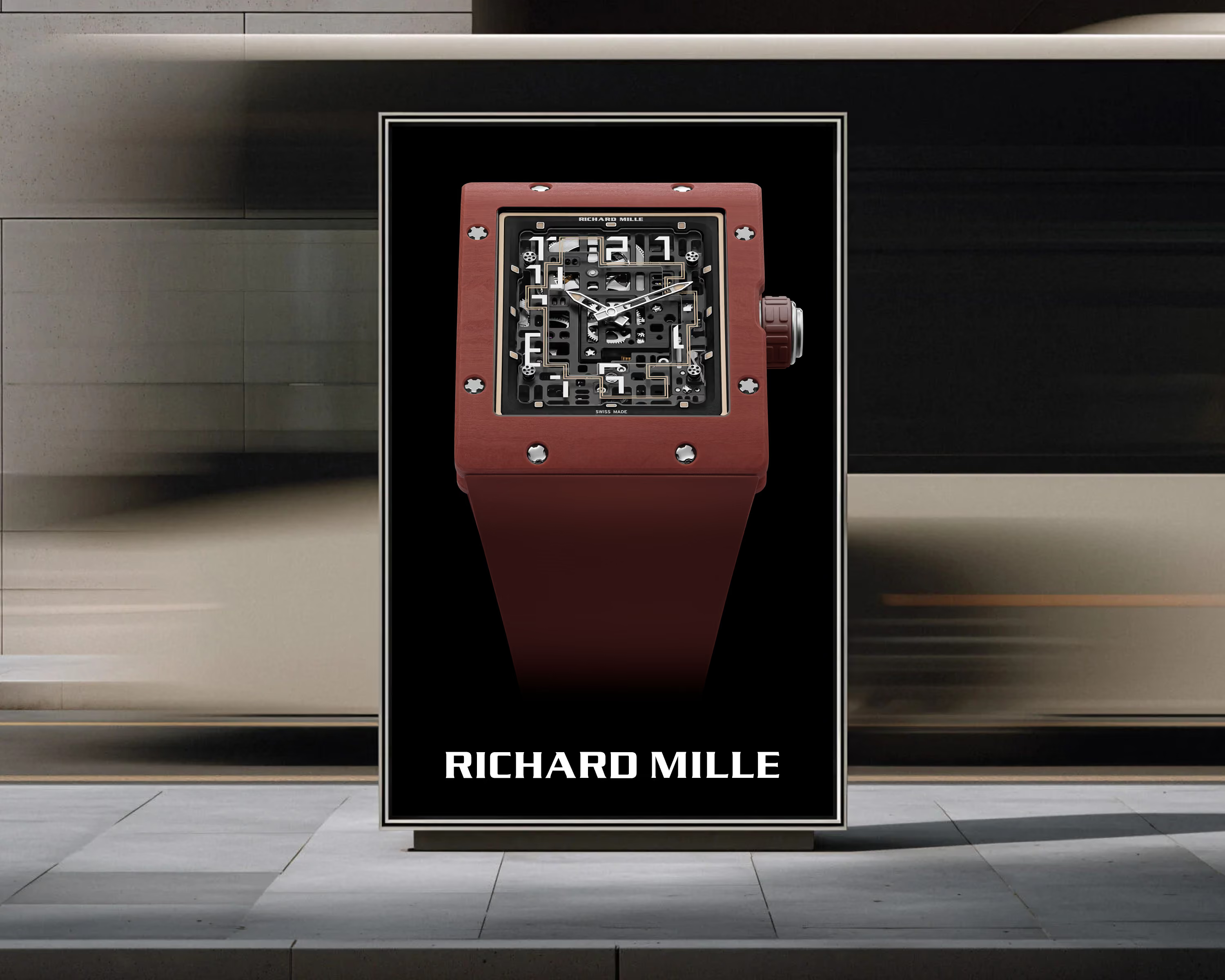
For the Swiss market, I wanted the campaign to stand out by saying less, not more. Rather than competing for attention, the creative direction relies on proportion, contrast and carefully considered space to create a quiet but confident presence.
Reduced to its essential elements, every poster gives the RM 16-02 room to speak for itself. It reflects a belief that thoughtful restraint often creates a stronger and more lasting impression than visual excess.
Every social platform should feel like a natural extension of the brand. Rather than chasing visibility through constant messaging, I imagined a curated visual ecosystem where each post contributes to a consistent and recognisable identity.
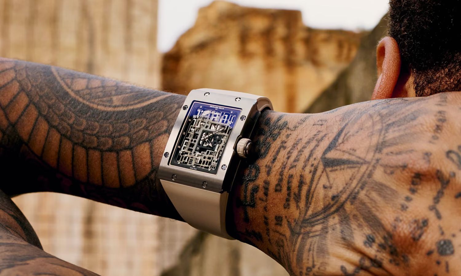
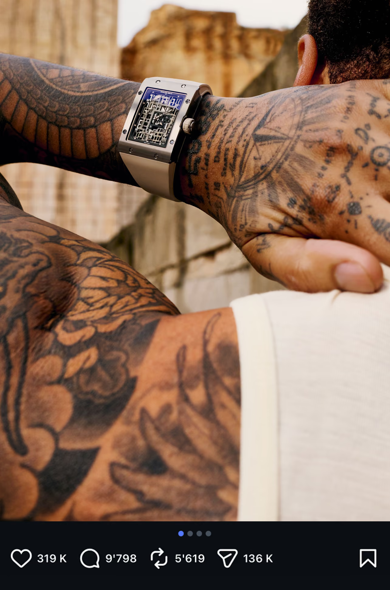
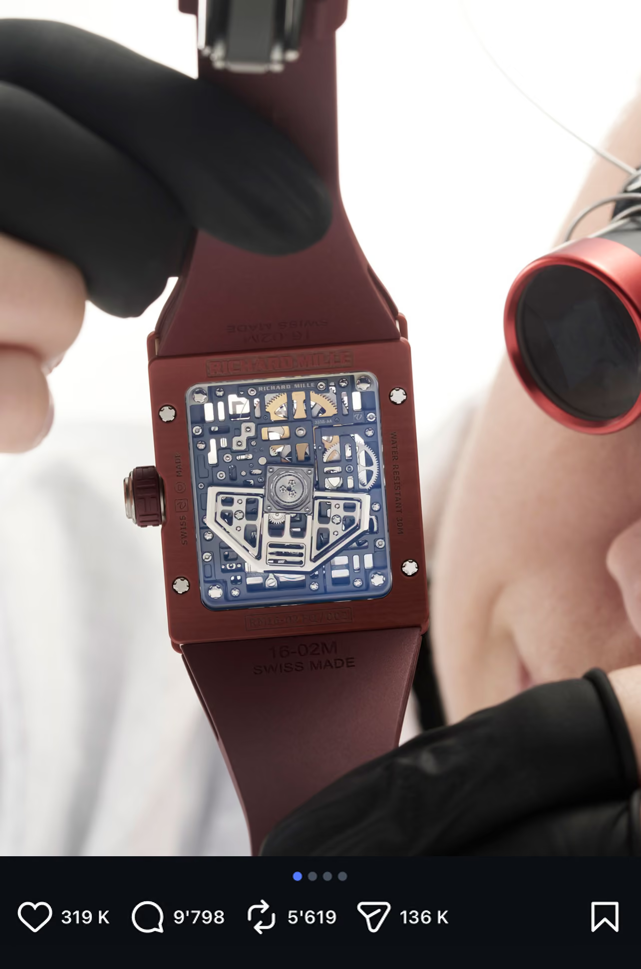
Photography, motion and macro details become storytelling tools, revealing the precision behind the RM 16-02 while allowing the product to remain the centre of every interaction.
This project wasn't created to redesign a Richard Mille campaign. It was an opportunity to explore how strategic thinking and creative direction can shape the way people experience a luxury brand.
More than a concept, it reflects the way I approach every project: understanding the brand, defining a clear vision and building experiences where every detail serves a common purpose.